Role: Senior UI/UX Designer
Techniques Used: Design System Architecture, Component Library Development, Visual Design, Atomic Design Principles, Collaboration with Development Teams.
Tools: Figma, Adobe XD, Adobe illustrator, Jira
Techniques Used: Design System Architecture, Component Library Development, Visual Design, Atomic Design Principles, Collaboration with Development Teams.
Tools: Figma, Adobe XD, Adobe illustrator, Jira
Project Overview
At Boston Technology, a healthcare service organization, I was approached to build a component library as developers and designers were creating similar components across multiple projects.
After researching available component libraries in the market and realizing that a full design system would better serve the company’s needs, I proposed building one. My pitch emphasized the advantages of a design system, such as enhanced consistency, scalability, and efficiency, which were approved by leadership.
Problem Statement
Boston Technology’s design and development teams often recreated similar components across projects, causing inefficiencies and inconsistencies. The lack of a centralized design system resulted in fragmented processes and redundancy. Moreover, the organization required a scalable framework that ensured visual consistency across healthcare products while accommodating each product’s specific requirements.
Research and Analysis
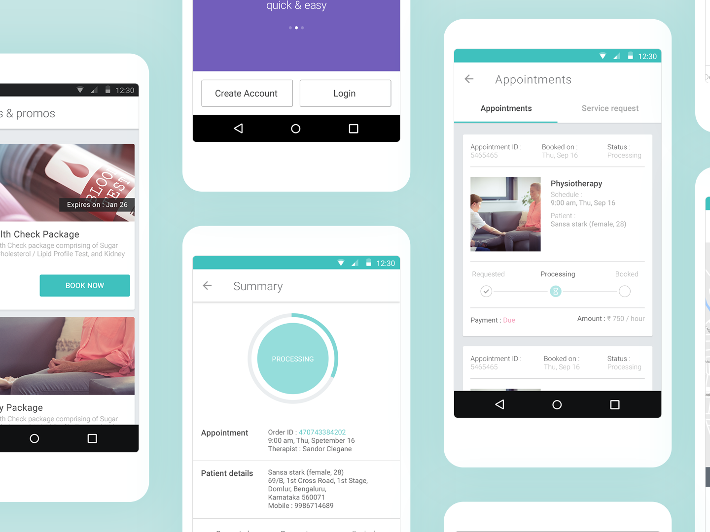
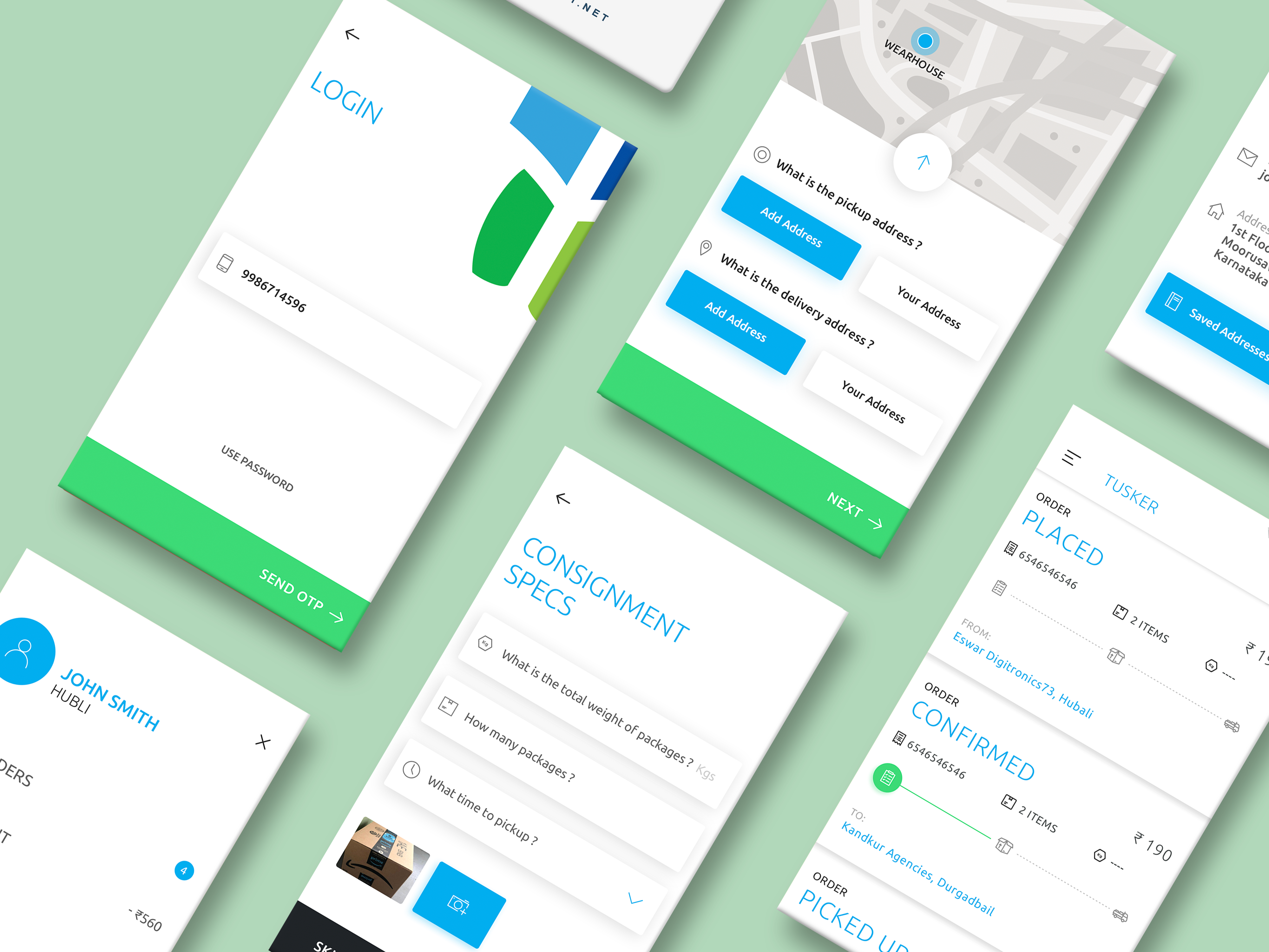
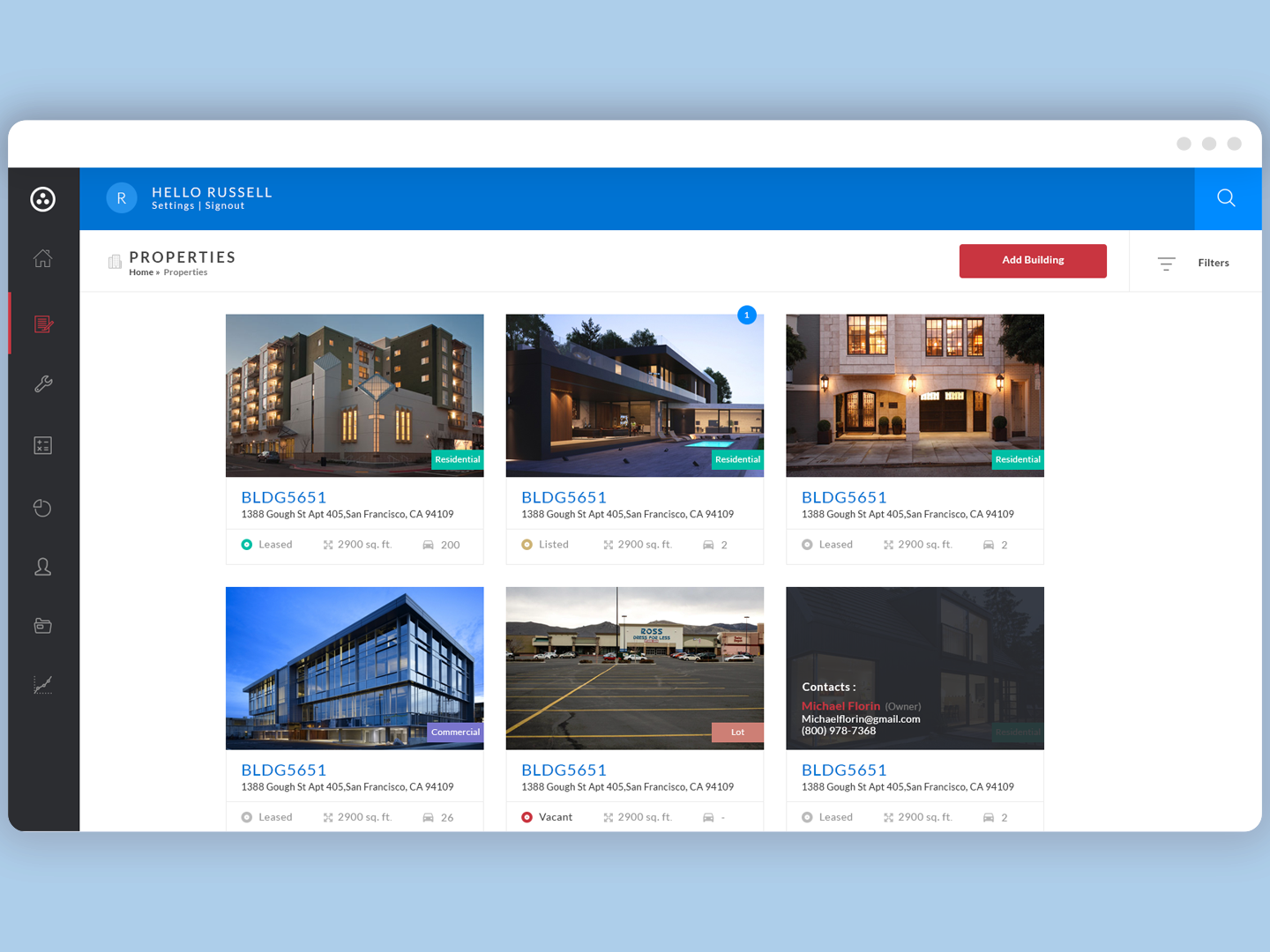
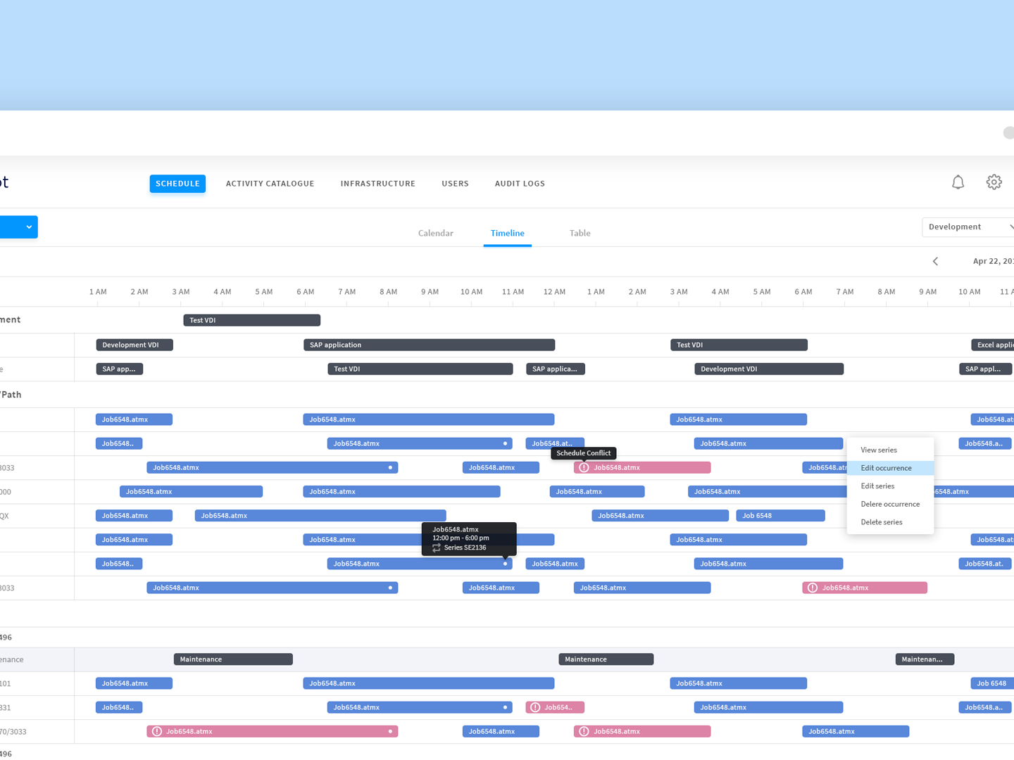
To create a design system that addressed these challenges, I began by researching existing systems like Material Design, Carbon, and Lightning Design. Additionally, Brad Frost's atomic design principles provided a modular framework for structuring the system. My work started with an audit of UI components across various products built at Boston Technology, identifying patterns and reusable elements for documentation.
Component Audit (for representation only)
Foundation and Flexibility
A major challenge was balancing flexibility and consistency, especially since Boston Technology is a service-based organization. Each product had unique requirements, so a rigid system wouldn’t work. To overcome this, I focused on neutral color palettes, flexible shapes, and minimalist layouts to ensure that the system could be adapted for a variety of applications while maintaining a cohesive look and feel.
Color System
Icon and Component Library
Once foundational elements were established, I built a scalable icon library of over 120 custom-designed icons, adhering to a cohesive style guide. Following this, I led the creation of a component library based on our audit and industry best practices. Each component was documented with usage guidelines, styling, and interactions, ensuring developers and designers could easily reference and integrate them.
Icon Library
Collaboration and Development
With the design system established, I collaborated closely with our engineering teams, who were responsible for implementing the system in React and Angular. The components were built using Storybook, which I researched and integrated to facilitate a smooth development process. I provided detailed documentation in Adobe XD and conducted walkthroughs for each component to ensure a smooth handoff. I continued to review and provide feedback during development to maintain consistency and fidelity to the design.
Component Library
Storybook repository(for representation only)
Outcomes and Impact
The introduction of the design system greatly streamlined the design-to-development process. It reduced development time, improved productivity, and eliminated redundancy. Additionally, the system brought visual and functional consistency to Boston Technology’s healthcare solutions, enhancing the user experience across products.
Key Takeaways
The project highlighted the value of creating a design system that not only improved efficiency and consistency but also allowed flexibility to adapt to various products; close collaboration with developers was instrumental in ensuring a successful implementation, and the system’s reusable components contributed significantly to a streamlined and cohesive user experience across our healthcare solutions.


